


INGENICO
Reimagining the developer portal for payment integrations across AXIUM, M360 and SoftPOS — cutting integration time by 60% and making docs a place developers actually enjoy.
Cutting payment integration time by 60%
Ingenico’s developer portal served three payment products with three logins and documentation nobody trusted. I redesigned it into one self-serve platform — where a developer goes from sign-up to first API call in minutes instead of weeks.
Three products, twelve pages, one frustrated developer
AXIUM, M360 and SoftPOS each had their own portal, own login and own documentation style. A basic integration meant stitching together 12+ pages — and when the docs failed, developers fell back to support tickets and StackOverflow.
One identity, self-serve by default
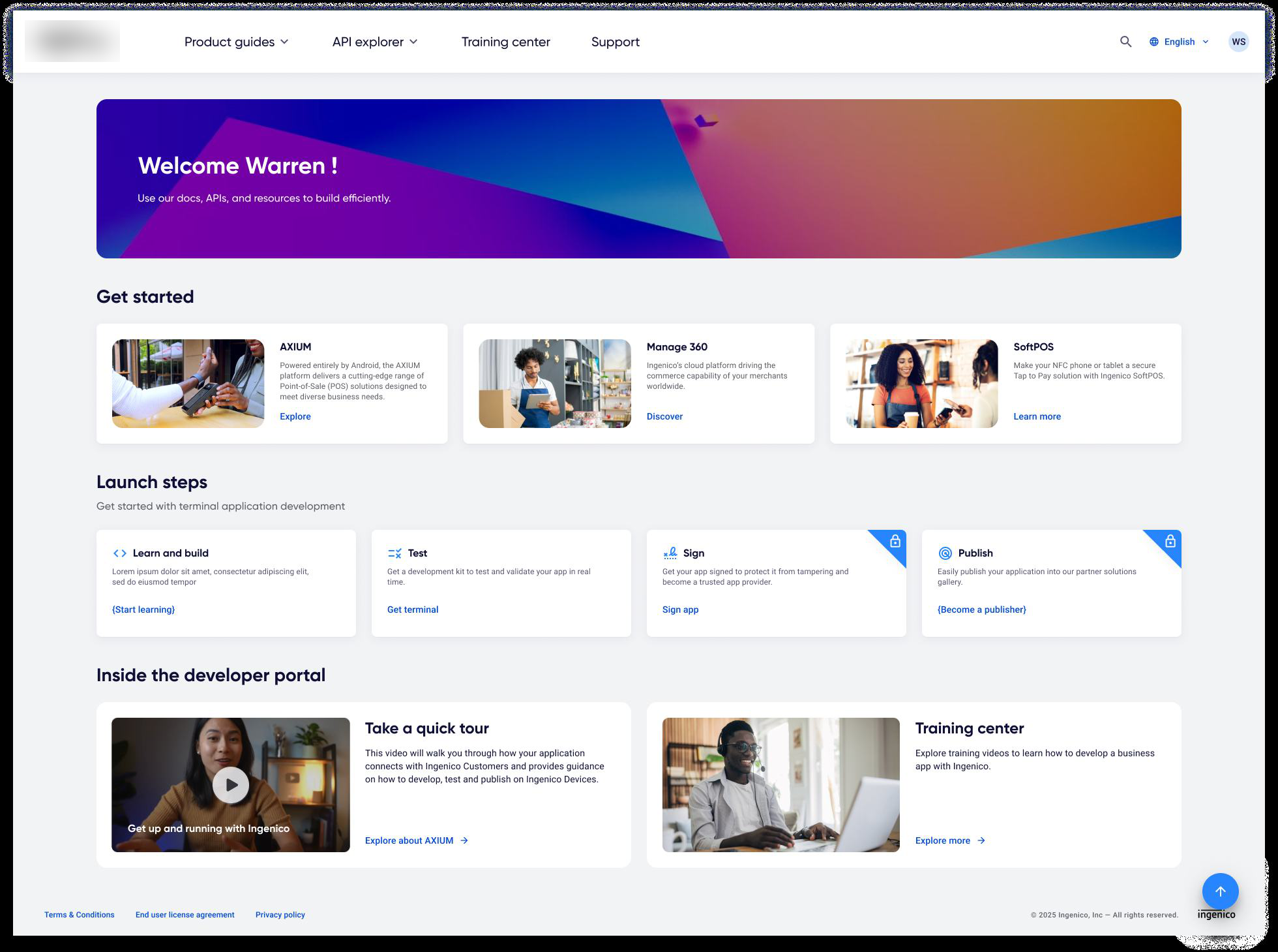
A unified portal where documentation adapts to the reader, sandbox keys are provisioned instantly, production unlocks through automated KYC — and contacting support becomes the exception, not the path.
Developers didn’t trust the docs
25 developer interviews, six months of portal analytics and teardowns of 8 leading developer platforms (Stripe, Square, PayPal…) told one consistent story.
$ audit developer-portal --products axium,m360,softpos
12+ pages to complete one basic integration
78% of support tickets ask what better docs should answer
25% of doc sessions happen on mobile — where the portal barely works
$ diagnose --root-cause
→ not missing content. every integration forces a dozen decisions the portal should make for the developer.
“Where do I find the API keys? I emailed support twice for something that should be a button.”
“If the docs are this messy, the API must be unstable. That’s just how you read a platform.”
{
  "role": "integration developer",
  "mindset": ["deadline-driven", "skeptical", "allergic to marketing copy"],
  "judges_a_platform_by": "how fast a copied code sample runs",
  "needs": ["copy-paste examples", "instant sandbox keys", "one login"]
}
What the portal had to prove
Four measures, written before the first screen — each one an answer to something research surfaced.
Sign-up to a first successful sandbox call — entirely self-serve.
target: minutes, not weeksDocumentation good enough that support becomes the exception.
target: zero-ticket integrationsAXIUM, M360 and SoftPOS behind a single login and shared context.
target: no re-login across productsVersioned, consistent, runnable docs that read like the API is stable.
target: “was this helpful” per pageHow we got there
From first interview to a unified platform — the path in five moves.
Research
Watched developers integrate — and counted every page, login and dead end.
25 interviews · 6 months dataInsight
Reduced every complaint to one root cause: too many decisions, not too little content.
1 root causeDecisions
Placed four structural bets — each against a cheaper, safer alternative.
4 betsPrototype & test
Tested two navigation models with developers — and let the losing one die.
2 nav models testedShip
One portal, one design system, three product lines migrated in.
3 products · 1 platformFour decisions carried the design
One portal, not three refreshes
Modernising each product portal separately — cheaper, safer, zero migration risk.
A single portal behind one SSO identity, with a product context switcher — because the maze between portals was the problem.
Progressive access, not a verification wall
Keeping manual verification before any API access — the compliance-comfortable default.
Tiered access — docs public, sandbox keys instant, production unlocked by automated KYC.
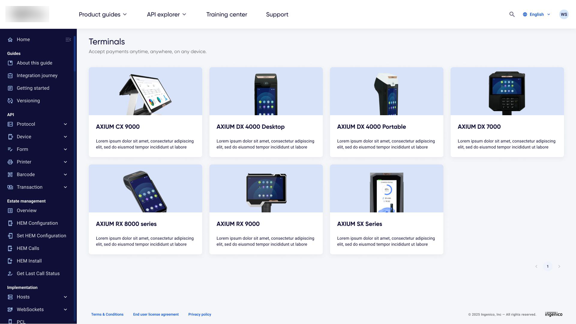
Docs that adapt to the reader
A big-bang rewrite of all documentation — more words, same structure.
A smart-context system — snippets follow your language, pages know your product, every example is copy-paste runnable.
A tokenised design system, not a reskin
Restyling the legacy UI in place — fast visible progress, no structural change.
Rebuilding the component library on design tokens, mobile-first — a quarter of doc reading happens on phones.
The navigation that didn’t survive testing
Two home-page models went in front of developers. Only one respected how they actually arrive — with a task, not a product name.
Product-first navigation
Organised the portal around Ingenico’s product lines. Testing showed developers bouncing between tabs — you had to know the org chart before you could find a document.
“Which tab are terminal APIs under?” — tester 3, after bouncing across all three products
Task-first, search-first home
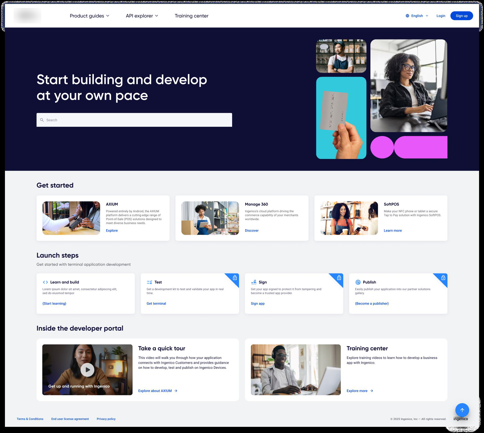
One search bar and “I want to…” quickstarts that route across products for you. The 12-page scavenger hunt became a single guided path.
“Found the config doc on the first search.” — tester 7, zero product-tab visits
One platform, every payment product
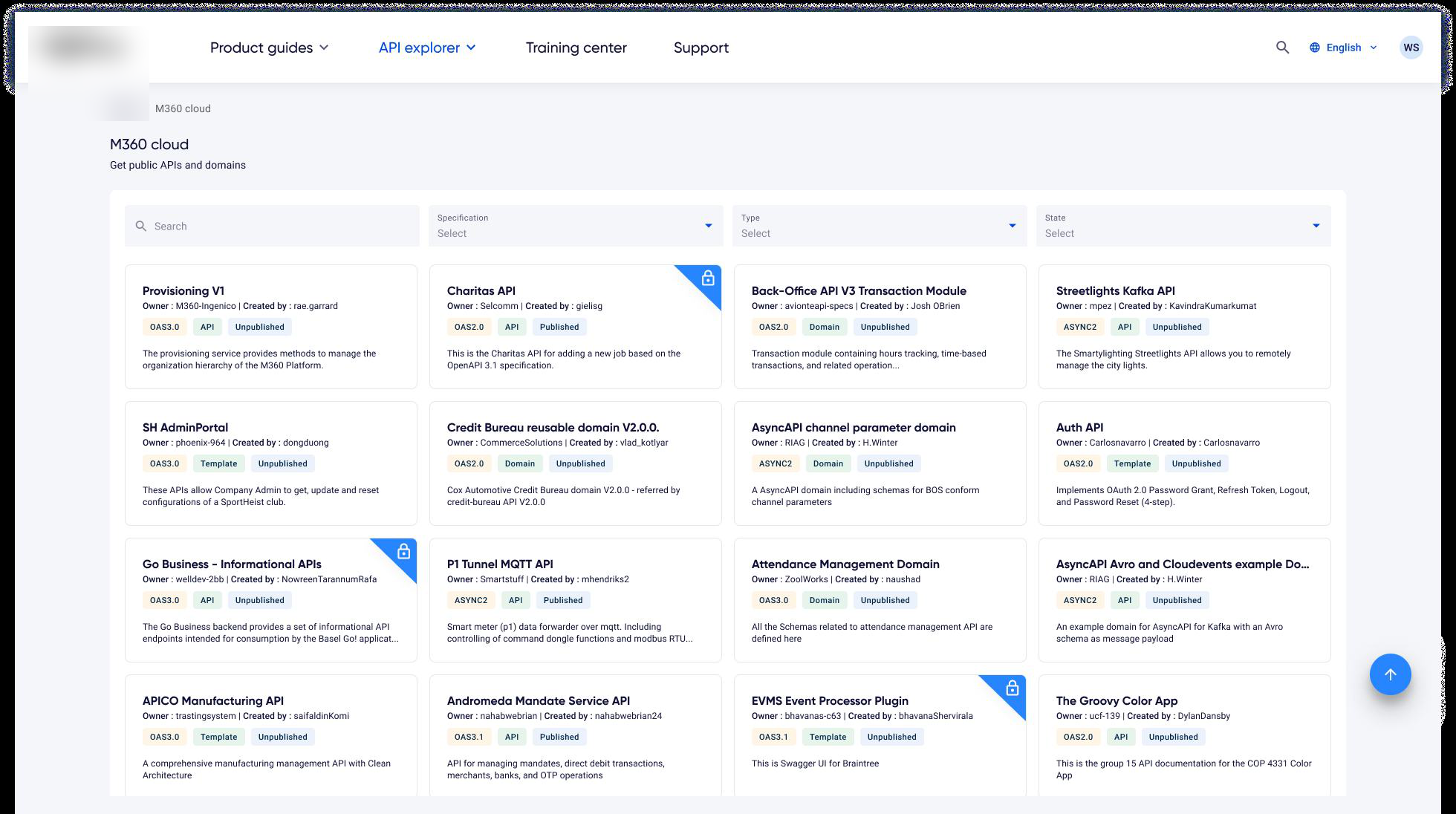
Three product lines feed one developer identity — and everything a developer needs sits one search away.
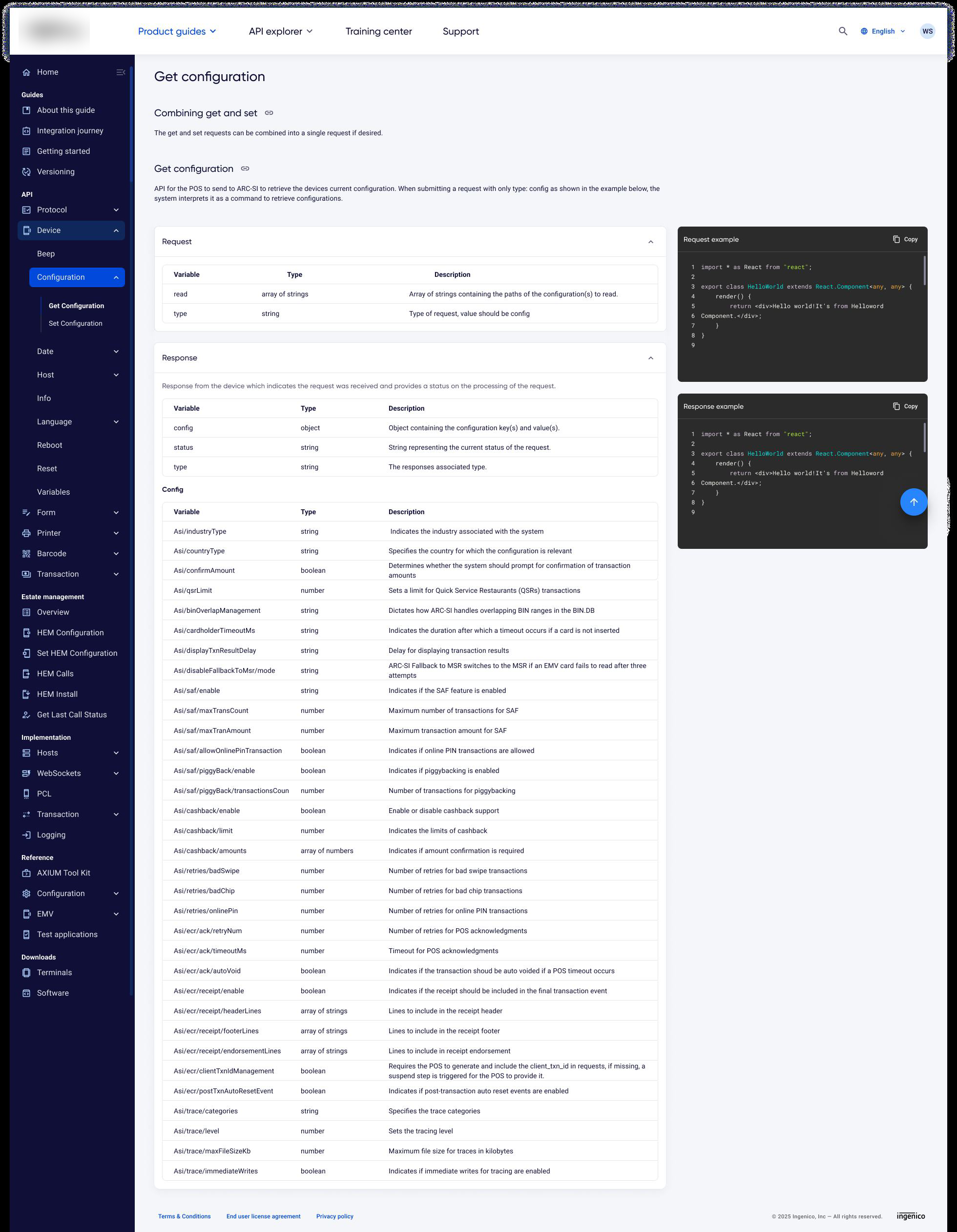
Five screens that carry the portal
A walk through the shipped portal — use the arrows to move between screens.
The outcome, in numbers
$ measure integration-time --before --after
-60% average integration time across AXIUM · M360 · SoftPOS
3 → 1 separate logins retired into one SSO identity
12+ → 1 pages for a basic integration — one guided quickstart
→ support became the exception, not the path.
Three lessons I carry forward
The call I’d defend
Progressive access. Every stakeholder push for “verify first, always” was pushing integration time back toward weeks. Tiered gating protected risk and momentum — and neither had to lose.
What I’d do differently
Bring the documentation writers in from week one. The structured-content model reshaped their whole workflow — co-designing it earlier would have removed the authoring friction we discovered late.
What changed in my practice
I now treat documentation as the product, not collateral. On a developer platform, the docs are the UI of the API — and they deserve the same design rigour as any screen.