






AI Lab
Where craft meets compute. A living workspace of the AI I weave into design — from generating production-ready UI and bridging Figma & code in real time, to the plugins and tools I build to remove the busywork.
Designing & shipping a Trade Window with AI.
A dense capital-markets Trade Window, taken from a single prompt all the way to live React — steering AI at every step, inside the existing design system and code libraries, so it ships consistent by construction.
Designed & delivered entirely with AI
Idea to production through AI — but always within the guardrails that keep an enterprise product consistent: the existing design system and the codebase’s existing component libraries.
AI designs on Blade, then converts straight to production React.
Every token and component is reused — so the screen matches the product by construction, and months of design-then-build compress into a guided session.
Existing design system
Designs on Blade — its tokens, components and variants reused.
Existing code libraries
Generated React uses the same in-repo libraries — zero new deps.
Entirely AI-driven
Brief → Figma → code, every step prompted via the MCP.
Consistent by construction
Design and code reuse the system, so parity comes for free.
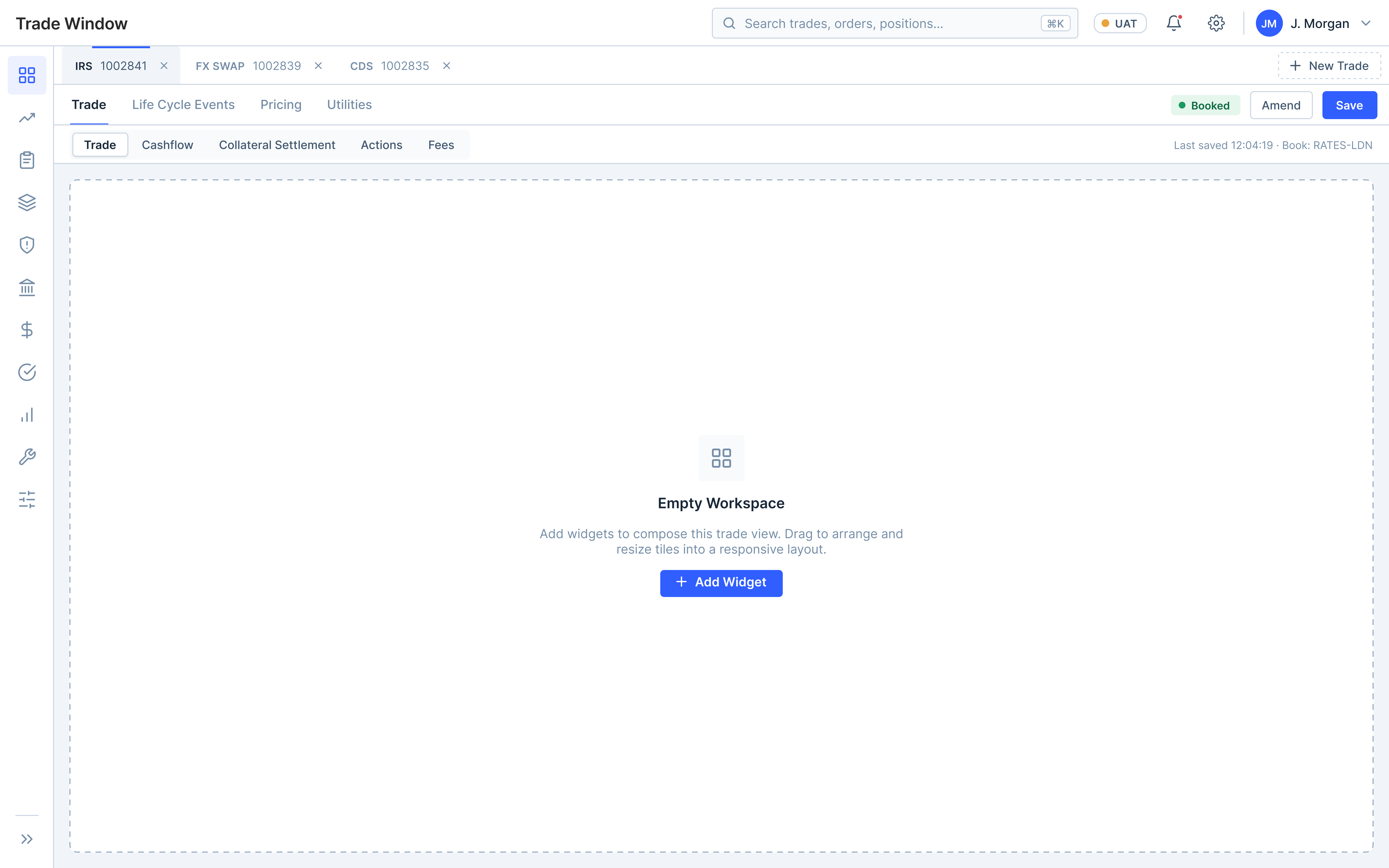
The layout, drawn by hand first
A quick pencil sketch of the workspace — the same structure the live screen ships with.
Prompting the design into existence
Six incremental prompts, each building on the last. Click a step to read the exact prompt and see what it produced.
# Role

You are a Principal Product Designer, UX Architect, and Enterprise Design System Expert specializing in institutional trading platforms such as Nasdaq, Bloomberg Terminal, Calypso, Murex, and Charles River.

Your objective is to redesign the Calypso Trade Window into a modern Nasdaq enterprise trading workspace while preserving enterprise workflows, configurability, scalability, and high information density.

Do not create a dashboard.

Design a production-ready trading workspace used by traders, operations, middle office, collateral, settlements, and risk teams.

# Design Context

Create a clean white enterprise interface.

Design principles:
- White theme
- High information density
- Minimal visual noise
- Professional typography
- Compact spacing
- Light gray surfaces
- Rounded corners (6-8px)
- Enterprise design language

# Application Layout

Create the following application structure:

1. Global Header
- Nasdaq logo
- Application title
- Search
- Environment indicator
- Notifications
- User profile
- Settings

2. Collapsed Left Navigation
Display only icons for:
- Dashboard
- Trades
- Orders
- Positions
- Risk
- Collateral
- Pricing
- Settlement
- Reports
- Utilities
- Administration

3. Main Workspace

Top:
Primary tabs showing multiple Trade IDs with '+' button for creating a new trade.

Below:
Secondary tabs:
- Trade
- Life Cycle Events
- Pricing
- Utilities

Below:
Third-level tabs:
- Trade
- Cashflow
- Collateral Settlement
- Actions
- Fees

Below:
Create an empty responsive widget workspace.

Do not design widget details yet.

Focus only on the overall layout hierarchy, spacing, navigation, and enterprise information architecture.

Use the existing design system from the design file and create the design in the file below using MCP:

https://www.figma.com/design/Ye9oJ90Ve9xFN7fOAcwbNZ/Untitled?node-id=1284-2103
Foundation — design
Drop the screenshot at assets/img/ai/foundation.png and it appears here.
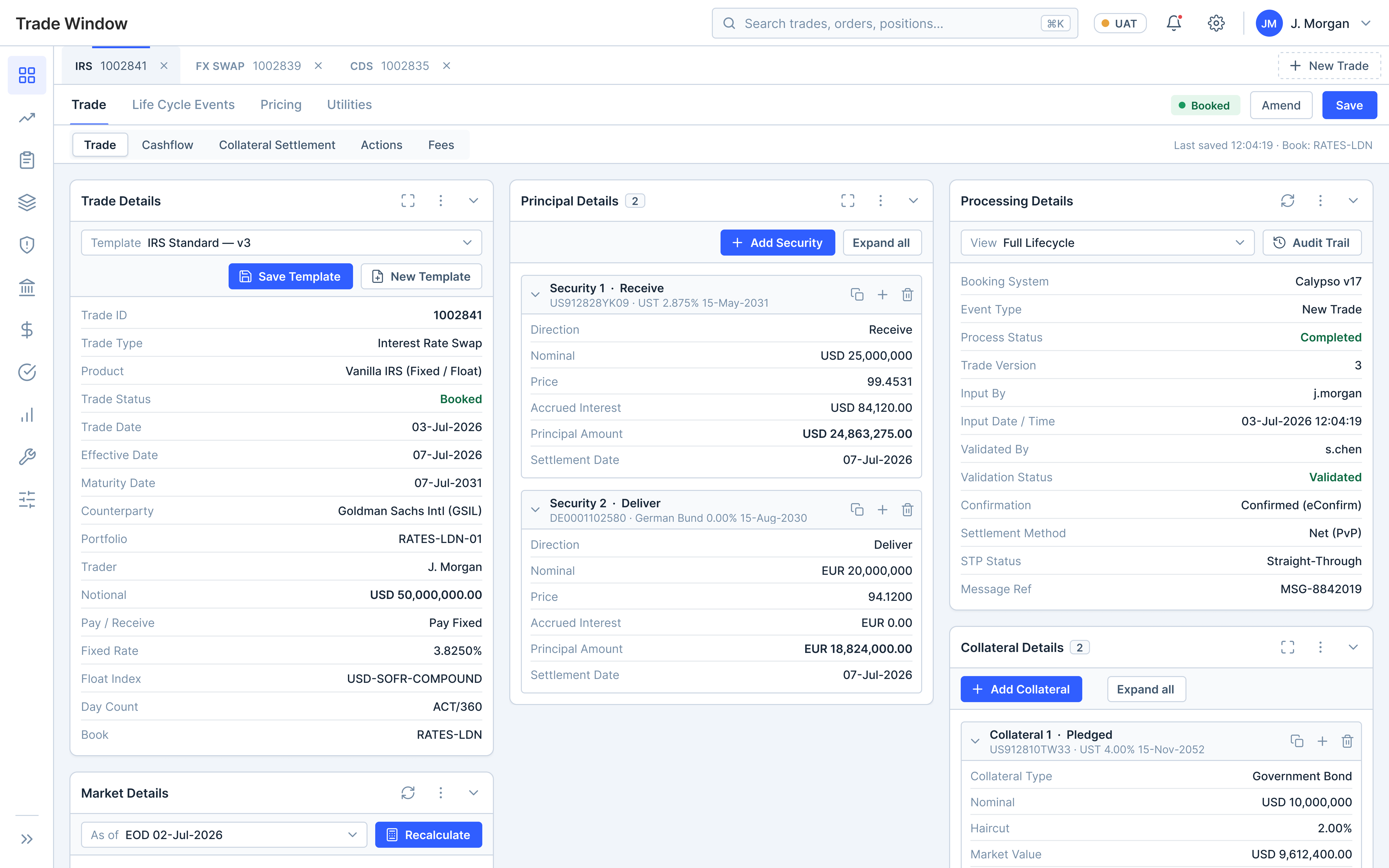
Populate the workspace with configurable enterprise widgets.

Create these widgets:
- Trade Details
- Processing Details
- Principal Details
- Collateral Details
- Market Details

Each widget should have:
- Header
- Actions
- Enterprise property list
- Professional spacing
- Widget toolbar

Trade Details should include:
- Template Selection
- Save Template
- New Template

Display fields using a two-column property list.
Left column = Field Label
Right column = Field Value

Populate every widget with realistic institutional trading sample data instead of placeholders.

Principal Details should support multiple securities.
Collateral Details should support multiple collateral securities.
Each security/card should support Add, Delete, Duplicate, and Collapse actions.
Add widgets — design
Drop the screenshot at assets/img/ai/add-widgets.png and it appears here.
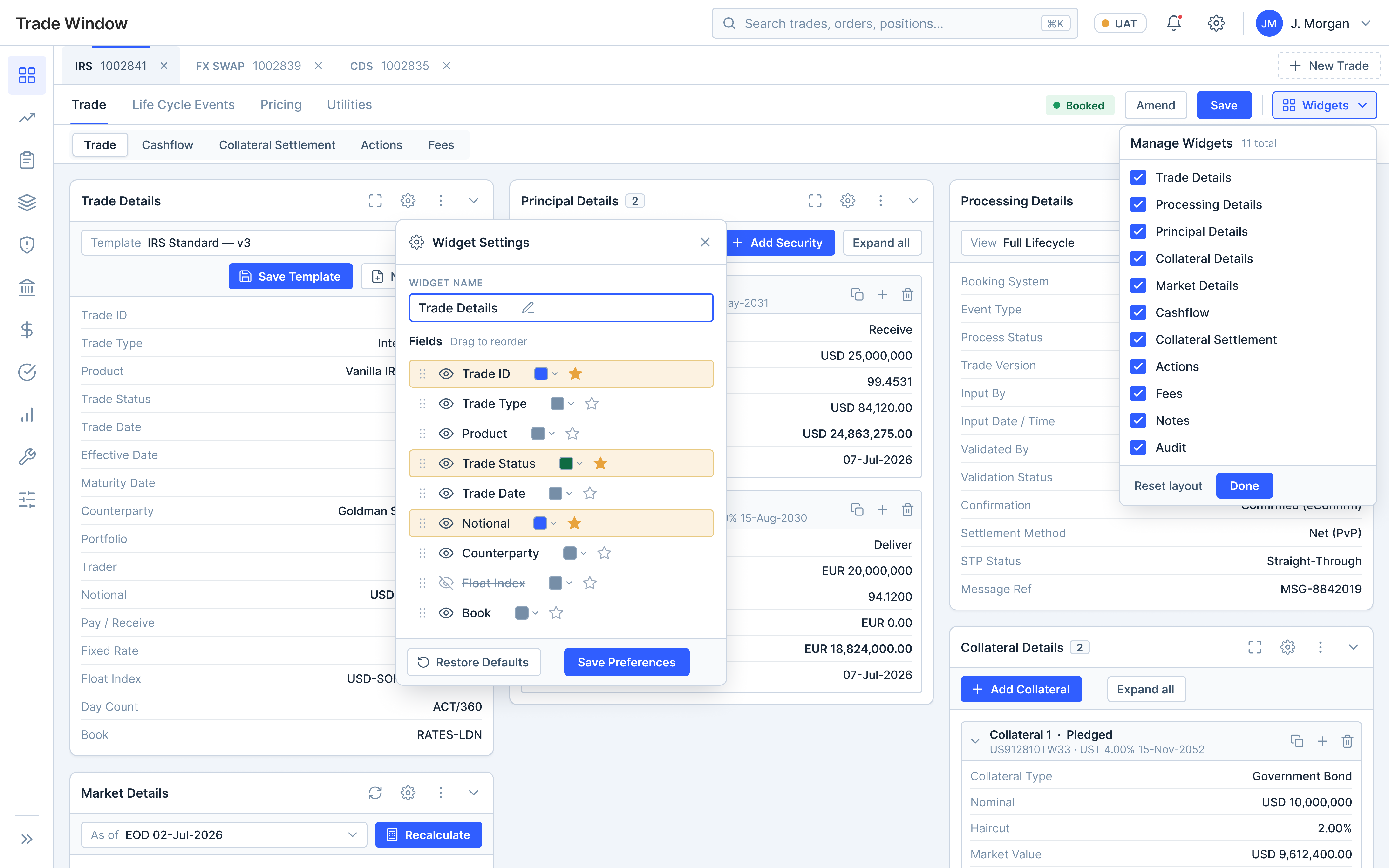
Add widget management capabilities.

On the right side of the secondary navigation, add a tertiary "Widgets" button.

Clicking it opens a dropdown containing checkboxes for every widget.

Example:
✓ Trade Details
✓ Processing Details
✓ Principal Details
✓ Collateral Details
✓ Market Details
✓ Cashflow
✓ Collateral Settlement
✓ Actions
✓ Fees
✓ Notes
✓ Audit

Unchecking a widget immediately hides it.
Checking it restores the widget while preserving its last size and position.

Each widget should also have a Settings icon.

The Settings panel should allow:
- Rename widget
- Rename fields
- Show/Hide fields
- Reorder fields
- Change field label color
- Highlight important fields
- Restore defaults
- Save preferences
Widget controls — design
Drop the screenshot at assets/img/ai/widget-controls.png and it appears here.
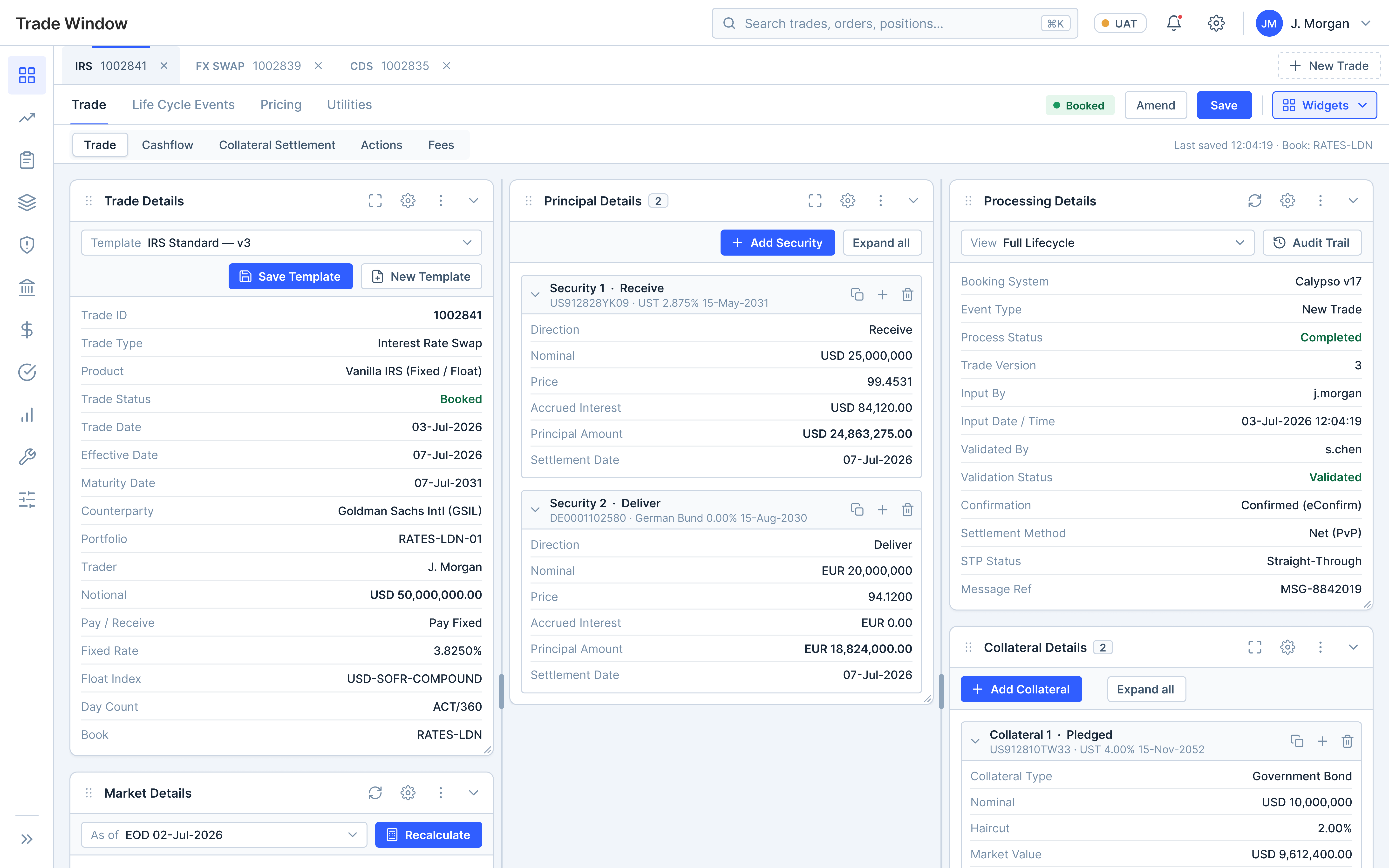
Convert the workspace into a fully configurable enterprise layout manager.

Every widget should support:
- Drag
- Resize
- Collapse
- Expand
- Reorder

Dragging behavior:
- Widgets swap positions when dragged over another widget.
- Display insertion indicators.
- Animate movement smoothly.
- Maintain grid alignment.

Resizing behavior:
- Resizing one widget automatically adjusts neighboring widgets.
- Prevent overlap.
- Remove empty gaps.
- Keep the layout balanced.
- Auto-wrap widgets when necessary.

The workspace should behave like Bloomberg Launchpad or modern IDE layouts instead of a traditional dashboard.
Drag & resize — design
Drop the screenshot at assets/img/ai/drag-&-resize.png and it appears here.
Update the workspace scrolling behavior.

Requirements:
- No horizontal scrolling in the main workspace.
- No vertical scrolling in the main workspace.
- The workspace should always fit within the browser viewport.

Only individual widgets should scroll internally when their content exceeds the available height.

Each widget should:
- Have independent scrolling.
- Keep its header sticky.
- Maintain actions visible while scrolling.

Users should never scroll the entire workspace.
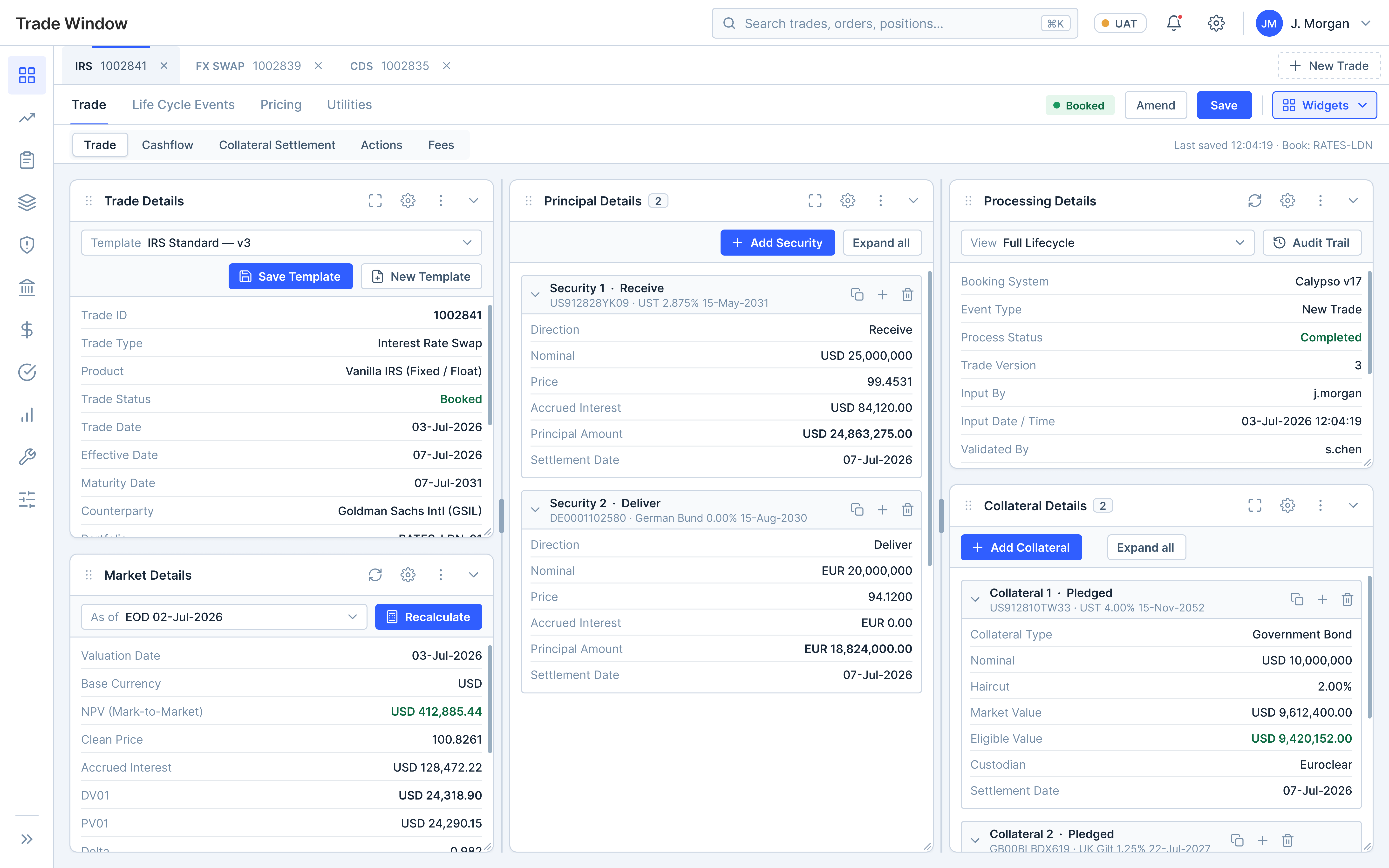
Scrolling — design
Drop the screenshot at assets/img/ai/scrolling.png and it appears here.
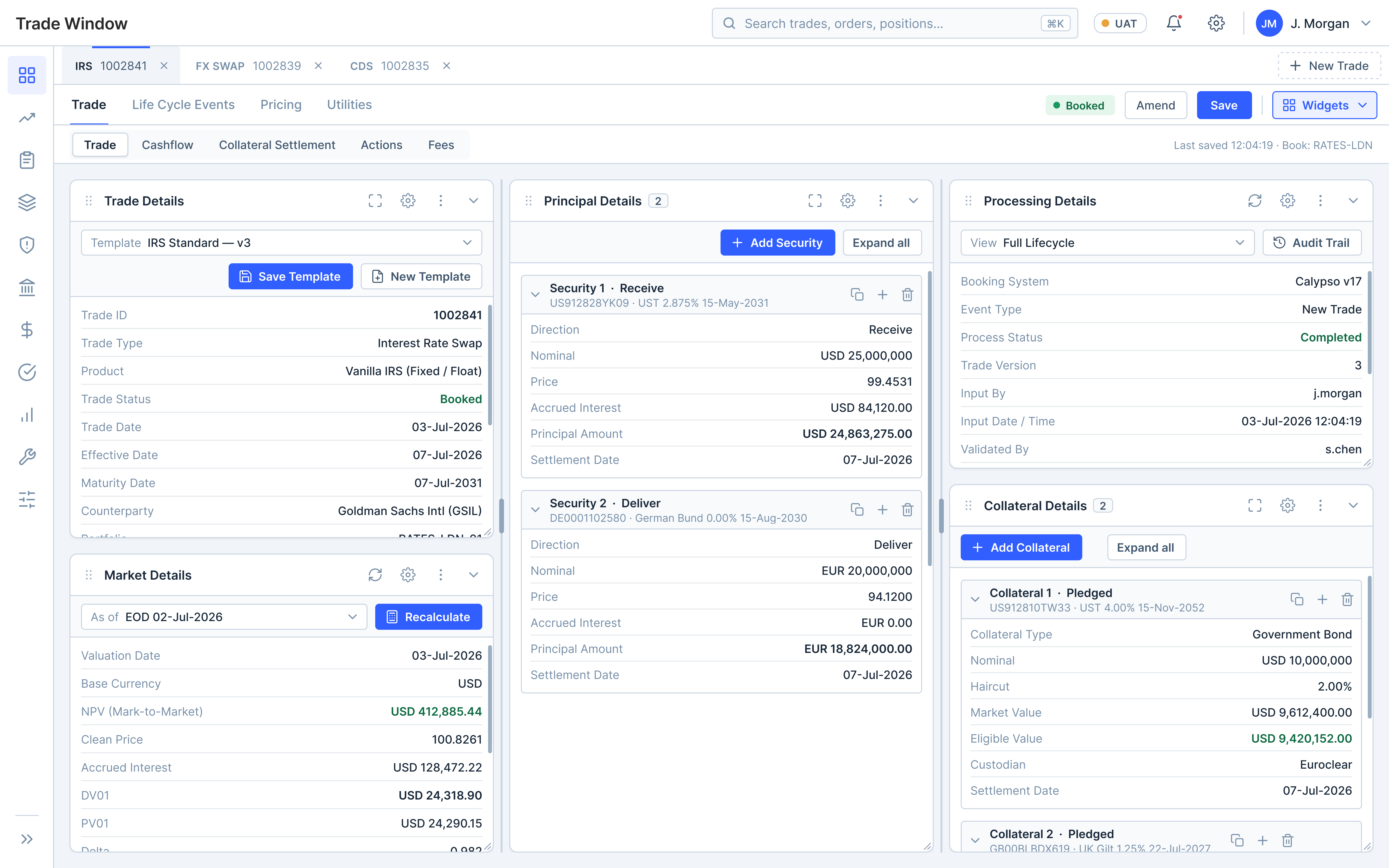
Final design — design
Drop the screenshot at assets/img/ai/final-design.png and it appears here.
From Figma to a live React screen
One directive converts the locked design into production React on Razorpay’s Blade, read from Figma via MCP — then the fully interactive workspace mounts.
# Role

You are a Principal Frontend Architect and Senior React Engineer with expertise in enterprise applications, scalable frontend architecture, design systems, accessibility, and modern React development.

Your responsibility is to convert an approved Figma design into a production-ready React application using the Blade Design System.

Do not simply recreate the UI visually. Build maintainable, reusable, accessible, and scalable code that follows modern frontend engineering best practices.

---

# Project Context

This project is an enterprise-grade web application that requires a highly configurable, responsive, and modular user interface.

The Figma file is the single source of truth for layout, spacing, typography, colors, component hierarchy, interactions, and responsive behavior.

Use the connected Figma MCP to inspect the design and extract:
- Component hierarchy
- Auto Layout
- Constraints
- Spacing
- Typography
- Colors
- Design tokens
- Component variants
- Icons
- Assets
- Component properties

Do not hardcode values that already exist in the design system.

---

# Objective

Convert the selected Figma screens into clean, production-ready React code while maximizing:
- Component reusability
- Readability
- Maintainability
- Scalability
- Accessibility
- Performance
- Consistency with the Blade Design System

The final implementation should match the approved Figma design with high visual accuracy while following frontend engineering best practices.

---

# Technology Stack

Use:
- React
- TypeScript
- Blade Design System
- Blade design tokens
- React Hooks
- Functional Components

Avoid unnecessary third-party UI libraries unless absolutely required.

---

# Design System Guidelines

Use Blade Design System components wherever possible instead of custom HTML: Button, Tabs, Box, Flex, Grid, Stack, Card, Table, Input, Select, Checkbox, Badge, Tag, Tooltip, Dropdown, Menu, IconButton, Drawer, Modal, Popover, Accordion, Divider, Spinner, Skeleton, Text, Heading.

Use Blade spacing, typography, colors, border radius, shadows, elevation, and design tokens instead of hardcoded CSS values.

---

# Component Architecture

Break the screen into reusable, self-contained components. Avoid large monolithic components. Create clear component boundaries and reuse common UI patterns. Organize components with a logical hierarchy and keep each component focused on a single responsibility. Extract repeated UI into shared components.

---

# Code Quality

Follow modern React best practices:
- Functional components only
- Strict TypeScript / strong type safety
- Proper prop interfaces
- Reusable hooks where appropriate
- Clean folder structure & descriptive naming
- Composition over duplication
- Small, maintainable components
- No unnecessary abstraction

Avoid inline styles unless absolutely necessary.

---

# Layout & Responsiveness

Preserve the layout exactly as defined in Figma — Auto Layout behavior, responsive resizing, alignment, padding, margins, spacing, grid behavior, component hierarchy. Do not approximate measurements; use Figma values or Blade tokens. Implement the responsive behavior from Figma: flexible layouts, responsive containers, proper overflow handling, adaptive resizing, sensible min/max dimensions, stable layouts across viewport sizes.

---

# Reusable UI Patterns

Identify repeated design patterns and extract them into reusable components: Property List, Widget Container, Section Header, Toolbar, Action Menu, Empty State, Loading State, Status Badge, Form Field Group.

---

# Accessibility

Follow WCAG guidelines: semantic HTML, keyboard navigation, proper focus management, ARIA where needed, screen-reader compatibility, accessible color contrast. Accessibility should be built into every component.

---

# Performance

Optimize for enterprise-scale usage. Avoid unnecessary re-renders, duplicate logic, deep nesting, and avoidable inline function creation. Use memoization only when it provides measurable improvement. Lazy load large modules where appropriate.

---

# Styling & File Structure

Use Blade styling utilities and design tokens — no hardcoded colors, spacing, typography, or arbitrary CSS values. Organize the project into logical modules: components/, shared/, layouts/, hooks/, utils/, types/, constants/, assets/.

---

# Code Generation Rules

Reuse components wherever possible. Eliminate duplicate layouts. Abstract repeated UI patterns. Prefer composition over inheritance. Separate presentation from business logic. Generate code that is easy to test and extend. Keep components modular and scalable.

---

# Validation Checklist

Verify before completing: visual parity with Figma, correct spacing/alignment/typography, proper Blade component usage, responsive behavior, accessibility compliance, clean TypeScript typing, no unnecessary custom CSS, no duplicate code, no unused imports, no placeholder implementations, consistent reusable components.

---

# Expected Deliverable

Generate a production-ready React implementation of the Figma design using the Blade Design System and Figma MCP. The codebase should be modular, scalable, accessible, maintainable, and aligned with enterprise frontend engineering standards — prioritizing code quality, reusability, and long-term maintainability rather than simply converting pixels into code.

---

Note: first pull the Blade Design System libraries from online, then work on the conversion.

Figma: https://www.figma.com/design/5sFuyIXykoBOGSMachVhis/UX-Case-Study?node-id=76-237&t=3R56p6S7QXybRSss-1
What the exploration taught me
Where AI ran ahead on its own — and where it needed a human to steer.
Thoughts on this approach
Where an AI-first, design-system-native workflow genuinely wins — and where it still needs a human in the loop.
Advantages
- Speed — weeks of design-and-build compress into a single guided session.
- Consistency by default — reusing the design system and code libraries means output matches the product with no extra effort.
- Design ↔ code in lockstep — the Figma MCP keeps tokens and components aligned, cutting handoff and reconciliation cycles.
- Cheap iteration — trying a different layout or behaviour costs a prompt, not a rebuild — exploration gets far faster.
- Focus shifts to intent — the human steers product decisions while AI handles the mechanical execution.
Trade-offs
- Bounded by the system — coverage gaps in the design system push work into custom territory, where AI is less reliable.
- Needs domain steering — specialised data and logic (repo, collateral, settlement) only get real with explicit context.
- Review is non-negotiable — generated code still needs human eyes for edge cases, accessibility and performance.
- Plausible ≠ correct — confident-looking output can hide subtle UX or logic mistakes — trust, but verify.
- Not a craft replacement — novel interactions and brand-defining moments still need human design judgement.
Review builds & live sites, right in the browser
Drop in a developer’s static build, point it at a local server, or paste a live URL. Flag issues on the canvas, inspect any element like devtools, triage by severity and category, then export a shareable report.
Audit a static build, a local server, or any live URL.
Sticky notes, blur, text & markers — right on the screen.
Element specs, spacing & gap measurements like devtools.
Severity, priority (P0–P3) & 8 issue categories.
Assign, filter & resolve issues across multiple screens.
Export the report to PDF, CSV, XLSX or JSON.
Figma widgets & plugins
Small tools I built to automate the repetitive parts of design — try any of them live in Figma.
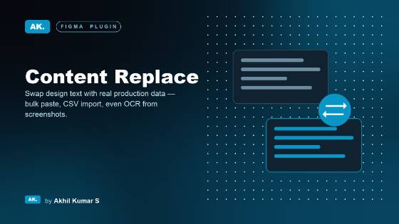 Plugin
Content Replace
A lightweight CMS for Figma — swap in real production data in bulk without touching a single layer.
View in Figma Community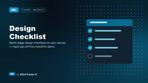 Widget
Design Checklist
A sprint-aware quality checklist that lives on the canvas — next to the work, not in a doc nobody opens.
View in Figma Community Plugin
DS Request Hub
Request new components and push component updates straight to the design system.
View in Figma Community Widget
UX Audit Tracker
Turns the canvas into a UX review workspace — track screens, log defects with evidence, export a report.
View in Figma Community Widget
UX Design Change Logger
Log the changes made on every single page, kept as a running history.
View in Figma Community Widget
UX Deviation Tracker
Give every design–build deviation a permanent, structured record on the canvas — pinned evidence, reasons, Excel & PDF export.
View in Figma Community